Well, I was lucky enough to get out of a bit of the work while I was stranded in L.A. for two months due to work. Oh darn.
Paint is a big part of putting a house together, or well our house. I LOVE me some color! And Jared is one to always have an opinion that differs mine with out hesitation. Both with our reasoning and strong mindedness, we were able to make a few compromises while seeking out the perfect palette for out little living space.
Ok, Living room....
I am not sure if you can tell much by the photo, but the previous owner had a little of the ketchup and mustard feeling going on here. Honestly, I didn't hate it. I didn't hate any of the paint coming it to the house, and I think it had something to so with why we actually fell for the house at first. The colors we not bad and it had color. I do LOVE nothing more then a clean white wall in a home but really, how practical is that for anyone. It's not.
Color adds a lot. It tells a story of who you are and gives others a welcoming feeling. So to make it more us, it needed a little face lift.
Flaming torch and Lotus leaf.
My forst job was in a paper ware house. Sounds funny right. We had over 150 different types of paper and it wasn't just white copy paper. We provided scrap book stores with their paper. One of the best parts of this job was that sometimes, we got to help pick out names of new paper that we were going to start carrying. No one wants plane jane purple, or generic bright blue. You want description, a name that will give that color life, ya... So flaming torch and lotus leaf it is!
Jared at work ... This was the beginning....
And two gallons of each color later.... here we are ....
Advice: Well this is more of an opinion. Don't paint a wall red. Just don't. Red is strong and bold, but it is harsh, hard to cover, and opinion: cliche. I said it. I'm sorry.
I love orange and I am so glad that Jared does too. I would never paint a whole room orange, because like red, I feel that it has the same effect on harshness. Orange is also a pretty popular mid century color choice. It feels great along side the blue and makes me so happy! We also decided to add it to the entry wall divider for pop. It is a small textured piece and makes a surprising impact when you first come through the door.
Next is our little hall way. It was the butter cup color in the living room to begin with and we updated it with a color called WASHED KAKI. Now this is no GAP kaki ... its a little more green, because I do not know what it is, but girl loves a green room.... Literal.
Guest room / Office : Originally, pretty wrigley's spearmint and I know i'm going back on my love for a green room, but not this green ....
Not to be borring, but it is the same WASHED KAKI. In a darker light it does look the more kaki part. I love it. Later you will see how it serves to be such a great back drop for our accents we added in the rooms.... (muah hahahhah)
Now the sad, gloomy master. Depressing. Thats how I feel some blues are. Sad. It doesn't make me want to be in the room. It makes me feel, blue ;)
You will never guess what color(s) we decided on!
GREEN!!!
Are you GREEN WITH ENVY!!!! Jokes friends ... jokes....
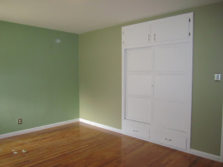
Ok So we picked two different colors of green for the room. We painted three of the walls SPANISH MOSS. For a little of an accent where the closet is, we chose a slightly lighter color of green, and I have no idea what the name is. I am sorry. I have looked and looked to try and match it. We try and stick with BJ brand paint but for some of the rooms, we branched out to Martha Stewart colors as well as BEHR ... It is a little hard to see because of the lighting but you can slightly tell in the corner where the two of them meet. Just a little pop.
SO if you haven't noticed, We love Green Orange and Blues and want to try and keep with the same palette through out the house and have one cohesive look. You will soon see!
P.S. I can't get enough of Al Green lately. And no I;m not trying to make a joke with the Green part.
Invest in some of him if you haven't.
Till next time!!!!!


I love these cool colours, Rach. I think GAP has a broken skimmer pant in that KHAKI. Fall into the Gap. And get the hell out. <3
ReplyDelete